For us at FAC – Fronte Acciaio Cromato, the conception and realization of the official 2025 graphic was a huge amount of fun. It was experienced from within a living artistic community that not only lives Carrara every day, but also survives it.
The event’s visual leitmotif adopts a fresh, seemingly light cartoon aesthetic that is nevertheless rich in symbolic references and layers of meaning. It is a graphic that does not want to impose a single, closed message, but instead remains accessible and open, capable of speaking to artists as well as citizens, farmers and proletarians, to casual visitors just as much as to those who know this city in all its layers.
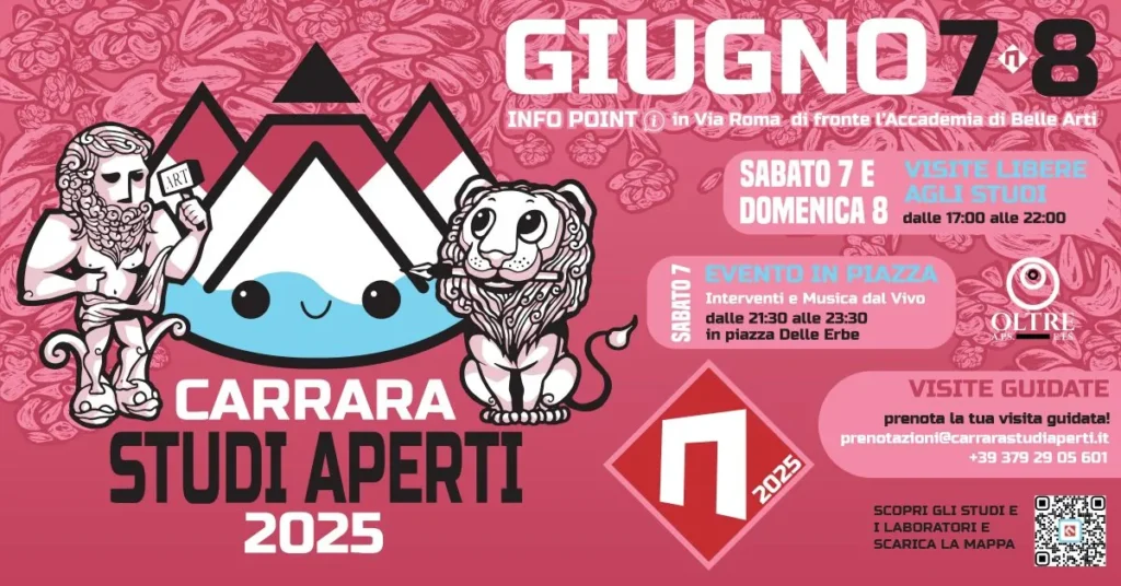
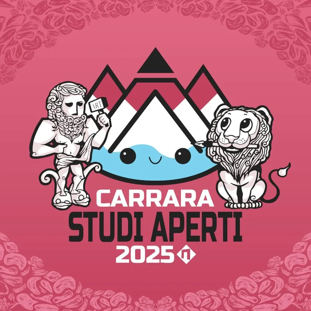
At the center of the composition, the marble quarries and our Apuan Alps become an almost living figure: a smiling mountain with its peak cut off, looking toward the sea. This ironic personification of Carrara itself is at once affectionate and critical. The smile does not deny the problem, it makes it visible: the intensive exploitation of natural resources, the price the territory pays for its historical and material wealth. In this context, art does not offer easy solutions, but invites a shared awareness, reminding us that every beauty also carries its own fragility. And that’s the end of it.
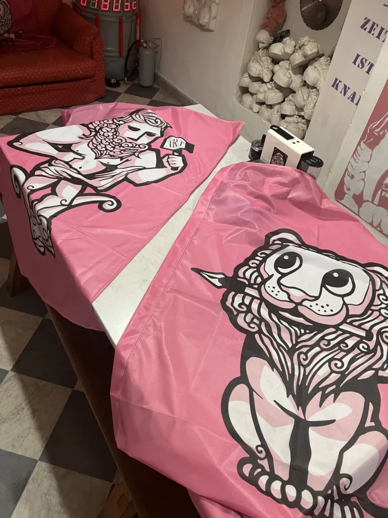
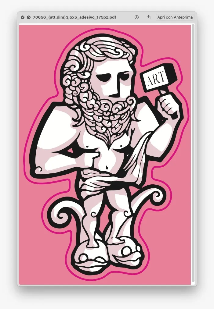
On the left side of the graphic appears the figure with the hammer, inspired by the statue in Piazza del Duomo (“Il Gigante”) and by the very practice of Studio FAC, namely, hitting things with a hammer. It embodies the physical and conceptual force of artistic action: the direct, crazy, courageous gesture. The word “ART” is engraved on the hammer, a clear and conscious statement. Art as a tool that can strike, shape, and transform, while also taking responsibility for what it changes. More self-flattery than that would have been too much, we do have limits.
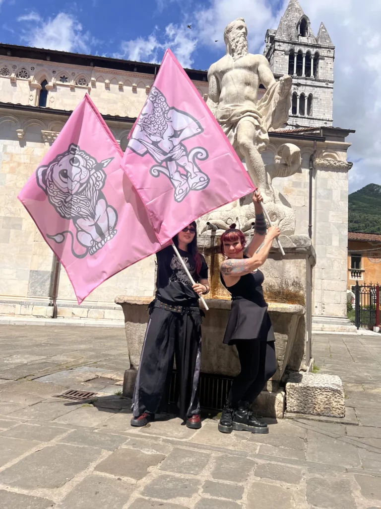
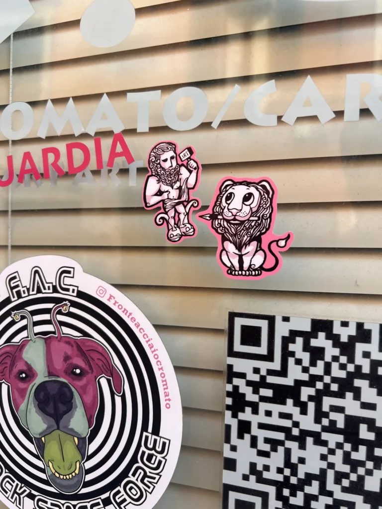
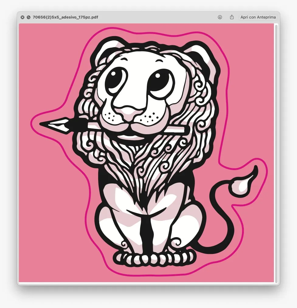
On the right stands a lion with a pen in its mouth, a playful FAC reinterpretation of the historic statue in Piazza Alberica. It represents the other soul of art: thinking, language, ideas, writing. Majestic and at the same time ironically pissed off, the lion escapes the rigid symbolism of the ceremonial and opens up a space for freedom of thought, without which everything quickly risks sinking into a fearful grey.
The visual and conceptual contrasts, human and animal, hammer and pen, mountain and sea, are the same ones that shape Carrara’s deep identity: a city suspended between nature and culture, extraction, creation and destruction, between historical memory and continuous transformation into marble dust.
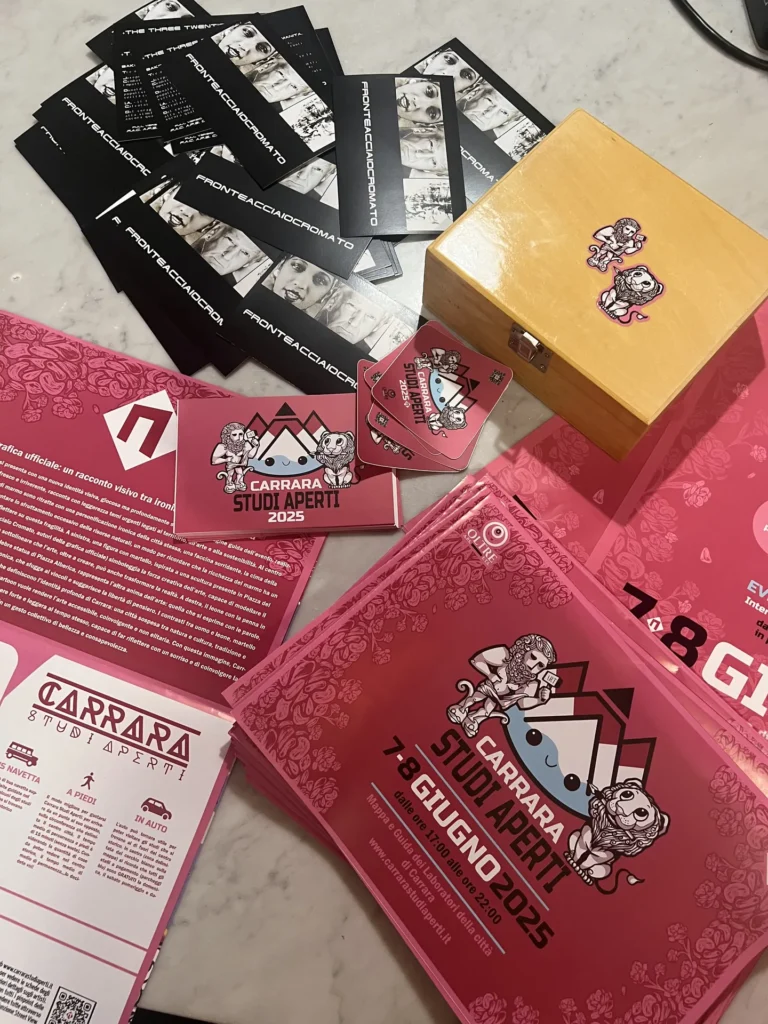
In this sense, the graphic is not meant to be just a promotional image, but a visual condensation of the spirit of Carrara Studi Aperti, an event that year after year opens ateliers, studios, and independent spaces, makes the everyday work of artists visible, and strengthens the connection between art and community. Even if you usually can’t make a living from it.
The consciously chosen cartoon tone by Yuanjun aka Erika is not a simplification, but a cultural and political decision: to make art accessible, never elitist, capable of involving people without excluding them. A visual language that invites a smile and makes children cheer. They wanted it. They wanted it. They wanted it. (Our stickers)
For us at FAC, taking part in Carrara Studi Aperti 2025 did not simply mean “being there”, but actively contributing to the construction of its image. Proud, of course, as the black sheep of the scene. Every phase of the creative process was fun for us, especially the studio presentation clip. Fucking great stuff.
In our view, Carrara Studi Aperti 2025 should try to show that art can be strong and light at the same time: rooted and ironic, capable of provoking thought with a smile and of gathering a community around a shared vision. Not killing each other. That’s what we always try to aim for.
We love the dirty old town of Carrara.
Thanks to the entire CSA team.
Carrara 2025